DinSide is Dagbladet's own consumer website that makes your everyday life easier. DinSide is for everyone, where you will find tips on everything from how to avoid mosquito bites on a hot summer night, to how you’ll find the best electricity deal.
DinSide is especially known for regularly conducting tests and reviews of various products. This is something that comes in handy when you are considering purchasing a product, but lacks information and a hands-on feeling about what to expect.
We quickly established that the new visual identity should stand out in a crowd, but still belong to Dagbladet's well known tabloid universe.
In order to do this, each category of DinSide has now been colour coordinated with a base colour. Today DinSide has 8 different categories that have been given their very own colour palette, with the possibility of easily adding new categories in the future.
When you click an article in the category "economy", the theme will be light blue – while if you click "home and leisure", the theme will change colors to pink. In this way, users can easily understand which category the article they are reading is actually about.
Each base color has two support colors, one light and one dark, so that the background colour and information boxes show more unity in the style of the article and the base color selected.
The new design profile is thus flexible, and ensures that users get a varied and better experience when reading articles.
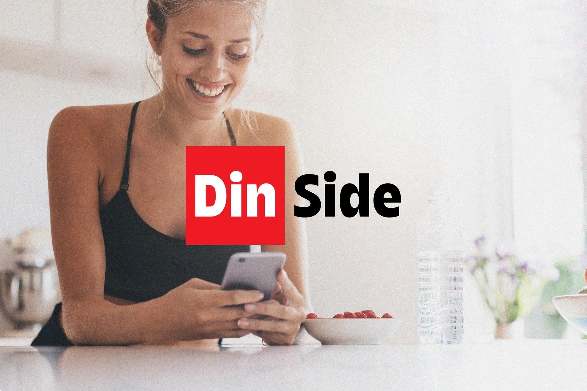
We also designed a new logo, which in this case involves a new logo set with logos in different variants. Each category has its own variant of the new logo, in the corresponding color in which the article is displayed.
The primary logo is set in DinSide's new profile, while it still has roots from Dagbladet's red and tabloid universe.
–
Visual identity and logo for Dagbladet’s DinSide.
Made as a part of Kult Byrå.
